Skip to Main Content

Presentations: Poster Design

Poster Design

Posters are a visual representation of your research, scholarly, or creative work. An effective poster is colorful and eye-catching, light on the text, and displays some sort of charts or graphics to support your points. Below you will find information that will help you to design a visually appealing poster presentation. 

Sizing and Font

Size

  • Set the page size first. Resizing the poster later will almost always cause problems.
  • Consider your presentation requirements. Find out if the conference has any regulations regarding size and format of poster presentations.  
  • Posters are typically printed on 42" wide paper rolls. You may need to trim your poster to the desired size after printing. 
  • Make sure you have a small margin (at least 0.5") on all sides of your poster. The printer cannot print to the edge of the paper so you need to leave room between the text/images and the side of the poster.

Font

  • Combine a serif font with a sans serif font. Contrast is key, do not use two fonts that are hard to distinguish.

  • For readability, use sans serif fonts for text and serif fonts for titles and headings. 

  • Try not to use more than 2 or 3 different fonts on one poster.

  • Use font sizes that are readable from at least 5-6 feet away

  • Titles should be larger than section headings, which are larger than text and captions

Color

Color can enhance your poster and attract viewers, if used effectively.

You might use color to: 

  • improve the visual appeal of your poster
  • highlight important elements in your poster
  • connect related information and improve the reader's ability to understand information more quickly

Things to Consider:

  • don't overdo it - bright colors can draw attention, but may be difficult to read.  Avoid using bright colors, such as neon shades.  
  • many individuals prefer to read dark text on light backgrounds. Light or muted background colors offer a more professional appearance. Also, when choosing a background color make sure there is enough contrast between your text and background colors so the text does not blend into the background.
  • maintain a color scheme, too many colors can be confusing to the viewer.  

Keep in Mind

  • some people have difficulty differentiating colors, chose colors carefully when creating graphs where you are trying to depict differences by color. Good practice - avoid using green and red next to each other to limit difficulties for those with color-blindness.  

Image result for Mock strawberries color blind

Mock strawberries as they appear to a person with full-color vision.

Photo of mock strawberries as seen by a person who can't tell red from green

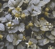
Mock strawberries as they appear to a person who cannot tell red from green.

Other resources 

  • Colors from Creating Effective Poster Presentations by George Hess, Kathryn Tosney, and Leon Leigel.  

Images

Images and visuals are a great way to catch your viewers eye and support your research without using text. There are a few things your should keep in mind when adding images or graphics to a poster. 

Copyright

  • If you use images from the internet, make sure you are not breaking copyright law.  You can ask permission from the source or use images that are licensed as Creative Commons.

Resolution

  • What you see on your screen is not always what you will get out of a printer. Unless resolution settings are correct, images that look great on your computer screen may look pixilated or grainy when printed. 
  • Pictures imported from web sites are almost always low-resolution images. Resolution must be high enough so as not to appear pixilated. Do not use a picture with high resolution (1200) and another with lower resolution (300) on the same poster.

Graphics

  • Graphics should be simple and clean in order to communicate information quickly.
  • Strong titles are essential. Titles should tell a viewer what is important about the graph or what the graph shows. Keep in mind, viewers only see what you tell them to see, therefore make titles clear and concise.  Also, be sure to include captions for your graphics. Captions help explain how to read the figure and provides the viewer with additional information.  
  • Avoid using 3D graphs because they can be difficult to understand. 
  • Know when to use what kind of graph.